Introduction
We have been conditioned to believe that premium value involves flawless execution – almost mathematical . But this is an illusion. True excellence always carries a subtle flaw on the outside which is anchored by deep inner alignment ~
The lesson of the orchid
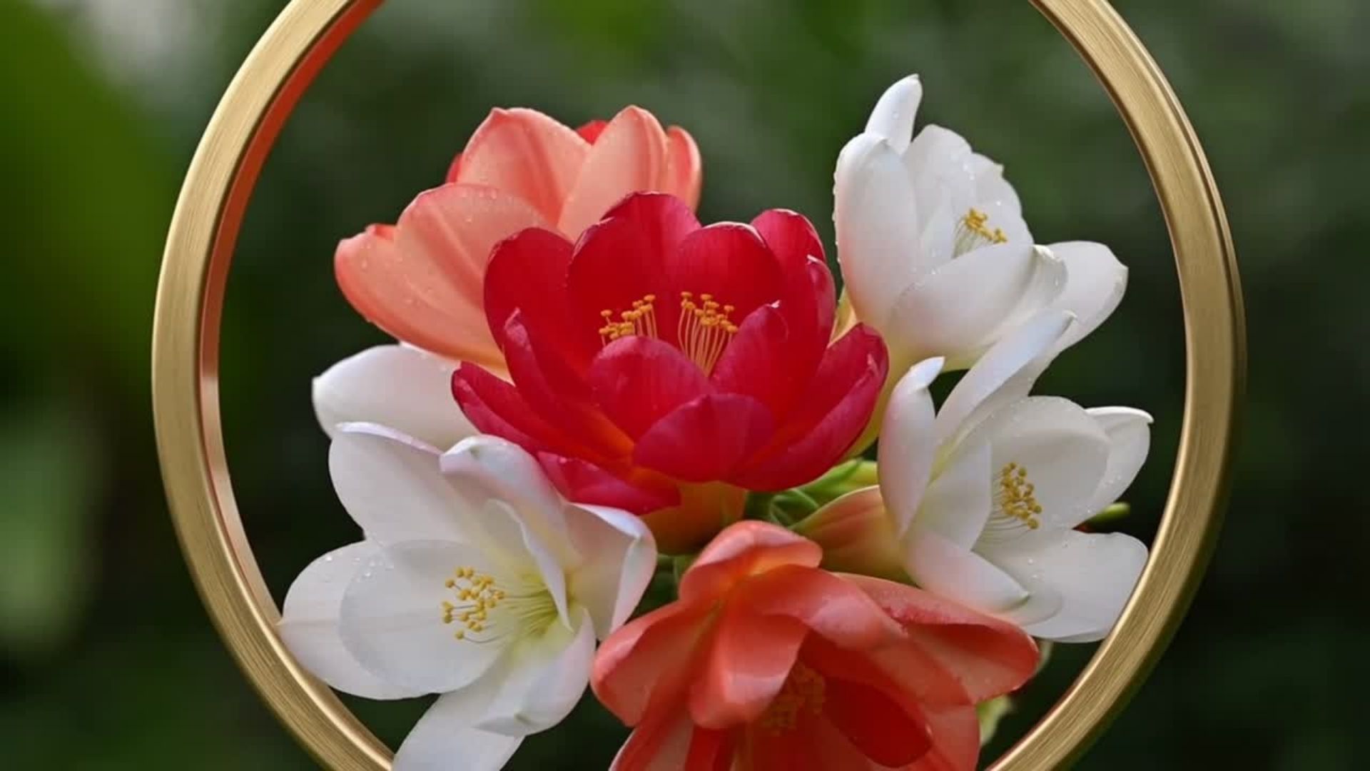
Place your gaze over a beautiful white or red fouzia orchid. At first glance you notice its, flowers: They appear perfect, elegant like jewels, vulnerable , graceful ~~
If you practice however your micro muscles of perception, you will notice that its stems twist at akward angles to catch the sun while its roots are thick tangled. It is exactly these asymmetrical roots that anchor the beautiful stems acting as a counter balance element.
According to the book ‘ Sprezzatura – concealing the effort of Art from Aristotle to Duchamp’ by Paolo d’angelo and “mathematical flawlessness” what we are conditioned to expect is actually what Aristotle called a rhetorical trap. The awkward, twisting stems and chaotic roots of the orchid are not mistakes; they are what make the plant look authentically alive and trustworthy to the human eye.
Sprezzatura
Welcome to the world of Sprezzatura
It is first encountered in The book of the Courtier written by a diplomat with the name Baldassare Castiglione . It an Italian word which carried the depth of Japanese Yūgen (幽玄) and the soul of Greek Meraki – μεράκι.
In this book Castiglione uses other terms as well such as the following:
Grazia (Grace): The elusive quality of attractiveness, poise, and charm which is achieved when one practices sprezzatura
La Grazia Mediocrità (The Golden Mean): The principle of moderation and balance
Affettazione (Affectation): The exact opposite of sprezzatura for example
Speaking with an overly formal accent or flaunting excessive knowledge.
The Anatomy of a Masterpiece:
Hermès Passifolia Tableware Collection
To decipher the secrets of Sprezzatura and the other concepts, we will examine how it lies behind the design of the Hermès Passifolia Tableware Collection
We will base our analysis on the metaphor of a perfume:
- Top Notes: The immediate surface grace.
- Heart Notes: The immense labor and technical complexity.
- Base Notes: The structural and emotional anchors that linger as the sillage
Top Notes: Asymmetry as Grace (The Illusion of Nature)
Traditional mid tier porcelain demands strict symmetrical perfection. Hermes plays with symmetry: on the surface , at first glance at least it displays asymmetry
The Calculated Accident (The Escaping Leaf)
The first thing one notices , the topic notes, is that the plates are meant to emulate a jungle which is organic, wild, free. A botanical leaf will recklessly spill over the gold outside rim
This element is The Escaping Leaf which acts as a metaphor for the “folly” and untamed chaos of the rainforest which cannot be bound by human borders.
A Living Ecosystem (The 30-Piece Collection)
The collection is made up of 30 pieces , none of which is the same as another.
The plates alternate rhythmically between dense botanical chaos, single-specimen close-ups, and minimalistic frames
One plate might feature a macro focused layout showing tropical foliage spanning the entire rim, while another will shift entirely from the dense design and showcase a minimalist leaf. And another focuses on texture variations rather than colours illustrating shades of celadon and sage greens, mimicking a soft tropical mist washing over broad palm leave. While these plates focus mainly on green elements the desert plate constitutes the thematic centerpiece and features an explosive passionflower (Passiflora incarnata) that commands the centre of the plate and the collection. It could act as the focal point found in Architecture
These element are spontaneous, they represent the first layer of grace, the lightness you see in one’s composure in the eyes, or the way s/he interacts with the world. But is grace really effortless?
To answer this question we are going to let the heart notes first and the base notes of the Passifolia collection ‘perfume’ reveal themselves to us and guide us gently into their secrets.
What looks like effortless grace on the surface demands 2 things
A Ιntense labour , depth
B: Ιnner alignment embedded in the molecules of the collection
The Heart Notes: Hidden Depth and Structural Labor
Depth
In order for the designer to create the collection she made use of the astonishing number 32 distinct pigments, which include 15 specific shades of green functioning as “underhues” or sub-tones
To give the botanical illustrations their hyper-realistic, three-dimensional depth, up to five different shades of green are layered onto a single leaf stem While the 15 underhues handle the complex botanical architecture of the foliage, the remaining 17 colors are reserved for the contours and explosive tropical blooms For example to contrast against the heavy green atmosphere the collection utilizes hyper-saturated fuchsia and coral
When it gets really interesting however is that these colours need different temperatures to heat up so the whole baking process takes place at different stages, while you just see on the surface a fluid continuous painting
Complexity
To help us understand the labour needed to create this incredible collection
The Mathematics of Distortion
it is worth noticing that Limoges porcelain shrinks by roughly 14% to 16% during firing.
It is for this reason that the artist must intentionally draw a mathematically distorted image on the initial print only for it to shirt and fall in its flawless place after it burns !
The whole design process takes approximately 2000 hours to finalise.
The Base Notes: The Paradox of the 24K Gold Rim
Each piece is bordered by a hand painted 24 karat gold Rim
This Gold Rim stands for:
Inversion of scale – Paradox level 1 The Semiotics of Inversion
Hermes deliberately downplays the economic weight of gold, having as a lofty aim for it to mimic the subtle beam of natural light cutting through the jungle leaf.
This brings us to first paradox of Sprezzatura in that the Heart Note presents itself as a Top Note in the collection. Just like Hermes downplays the value of Gold, likewise the collection appears as pure spontaneous grace while there is immense depth and complexity underneath this ethereal image.
This is also evident in that the large oval plate contains massive blocks of clean white space with just one leaf focus , while the small bread plate depicts hyper dense foliage, not to mention that the most elaborate design is found in the hollow parts of the porcelain itself.
Having talked about the first signified of Gold now we move to the second which anchors the whole collection and ties everything together
Alignment Inner Alignment and Visual Tension
The gold rim is there to frame and embrace the chaos so that it doesn’t spill over.
Just as the gold element is hand painted on the collection, inner alignment lies within the molecules of it, it is an structural element running across each plate and all of them together.
Let’s shed some light on how Hermes strikes this inner balance.
Asymmetrical balance – Alternate rhythmic tenision
Single plate
Within a single plate the bottom leaf might be saturated green while the top one, s palm leaf sits delicately in the upper blank space
Low density characterizes the high open space while hight density with zero open space is the signature of the lower part of the plate
This is actually part of the genius of the design in that if you place a massive white space next to a hyper dense vibrant explosion there is visual tension.
The whole collection breathes in that negative space is treated with the exact weight as the painted Art .
Collection -alternating rhythms
As far as the whole collection is concerned this tension manifests itself in that the 30 pieces showcase a tropical flora wrapping organically around the rims .
While the collection is made up of all designs and sizes it is bound by a fierce inner alignment which is no other than the shared palette of colours and the unifying gold rim
Moreover, in standard design plates are kept separate in Hemres we have a stacked setting
If you look at the top plate a vibrant botanical stems violently cuts off the right. On its own it is incomplete, a visual flaw but if you look at the large plate underneath the trajectory of the the line of the stem continues on the second plate.
The visual momentum skips across the physical gap between the plates.
This is the equivalent of the orchid stems which transforms individual asymmetrical chaos into a unified breathing landscape.
The gold rim itself doesn’t just frame the jungle design, it also acts as an emotional anchor , it signifies the confidence of a House that doesn’t need to rely heavily on precious metals to prove its worth
Because it is hand applied there are minor differences between the plate which means each one of them catches light unevenly as you move around the table
It wraps complexity into a warm solar embrace
Being an architect of one’s life
To pause and reflect Passifolia and Sprezzatura offers wise guidance in relation to being an architect of one’s life.
The passive consumer when a turbulence happens , gets destabilized often consumes status symbols to mask their inner void They try too hard ( afftetazione)…
The architect on the other hand plays the game of life with the orhid’s twist:
Like the stems which twist at akward angles to catch the sun they make bold off centre choices leaving intentionally vast areas of white space to protect their peace .
They possess subterranean compass ( the values, the under hues rituals, the knowledge ) they don’t flaunt symbols and they absorb the volatility of life integrating it it into their narrative of life , downplaying their status
They know premium value is not one brand more but a soul so perfectly aligned that any abnormality is a true value And when they do buy luxurious things the latter do not own them
While sprezzatura gives the impression of casual representation is in fact deeply paradoxical
Its deep paradox ( level 2) is that
Unpolished raw energy is sloppy but robotic perfectionism is dead