( Vignette- short and light analysis )
What is a website could reveal it essence the same way a Hebrew Shoresh reveals a word ? Aman Venice does this exactly.
Aman Venice : How the website design DNA echoes repose
2 Global anthology of hotels
3 The New Trésor Love Story Penélope Cruz at the Louvre Museum By Lancôm
Shoresh
The shoresh is the Hebrew root of words. It is usually composed of 3 consonants, some times 2 or 4. It is like a semantic nucleus, the DNA out of which bloom interrelated in terms of meaning words by adding suffixes, prefixes and vowel patterns.
The patterns when it comes to verbs are called binyanim. The latter means structure. It is a pattern of vowels, prefixes and suffixes that are applied to the shoresh in order to give grammatical meaning, such as voice ( active, passive, reflexive) or intensity. There are 7 binyanims :
Pa’al , Nif’al , Pi’el, Pu’al , Hif’il, Huf’al, Hitpa’el
To exemplify how the patterns work we will take the root for love:
The letters א-ה-ב (aleph-hey-bet) form the root for “love”. ( written from right to left)
Now let’s say we want to use the Pa’al pattern
The pattern is as follows: C1 C2 C
1 stands for vowel which looks like a T shapes mark , you place it under Aleph א
The second vowel looks like a horizontal like you place it under -ה-
Under ב you don’t place a vowel
So he loved looks like אָהַב
If verb patterns are called binyahim the patterns for nouns and adjectives are called mishkalim.They can express a state, a quality, a profession, place. They are made of vowels , prefixes and suffixes once more .There are many mishkalim, but there about 20 – 25 which are used often in Biblical and Modern Hebrew.
Ih Hebrew, the shoresh expresses the core essence or energy, it is living motion a verb force. Reality for the Hebrew is living and relational.
To exemplify this we are going use the webpage of the hotel Aman Venice whose shoresh is the essence repose.
Let’s play and use the 3 consonants of the word repose r p s to evoke a root out of which semantic ripples arise.
Typography – whispered sophistication
The typography ( serif classical) does not shout. It rests upon the page, while repose is also present in the generous spacing of the webpage. The typography is contemporary yet timeless without ornament .The overall composition reflects the Aman brand’s devotion to grace over excess.
Temporal motion
Any transitions between visuals is almost imperceptible , a fade a slow dissolve , the mastery of tempo lento, resembling the glide of the canal waters .
Palette
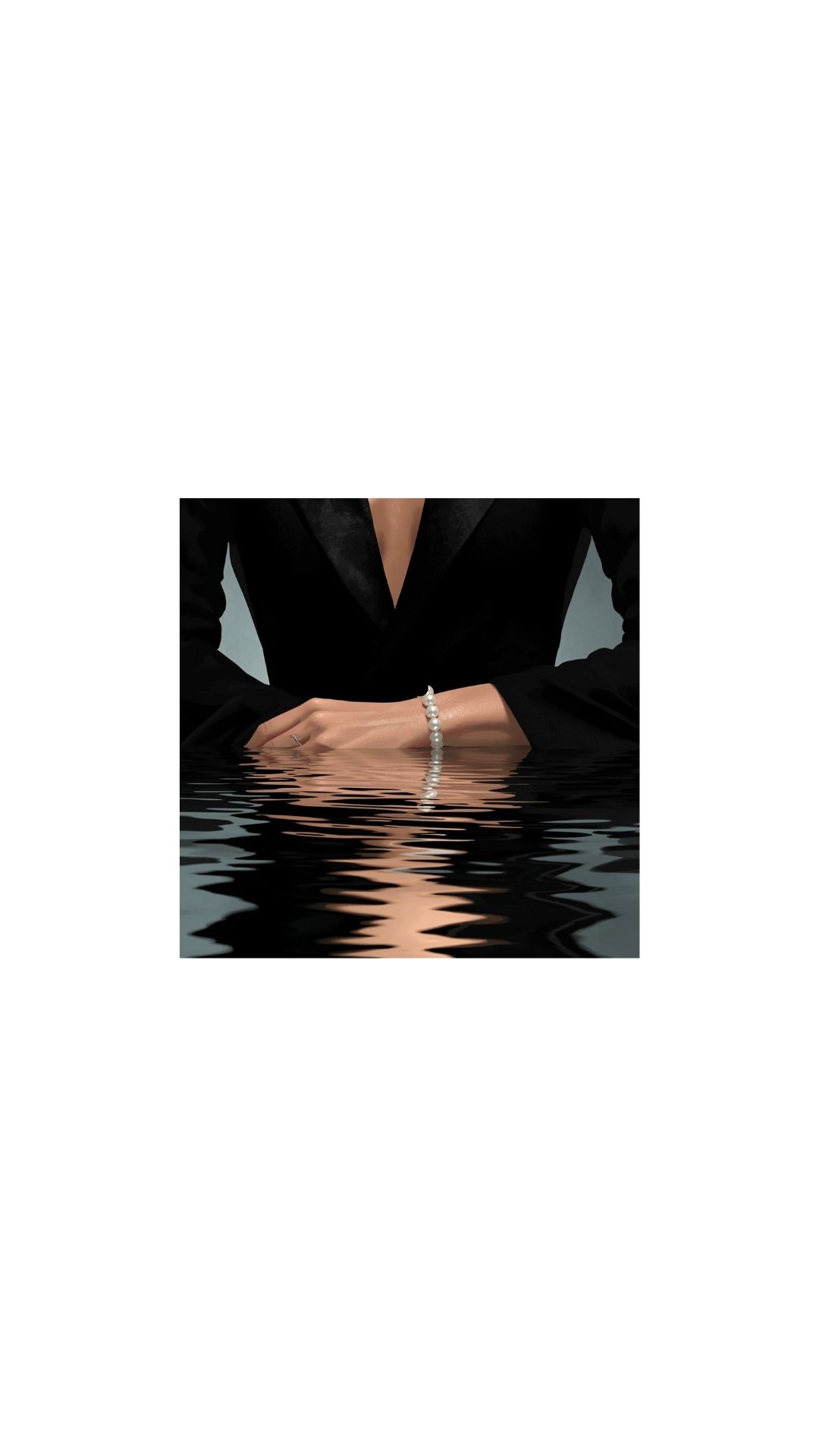
The soft blues, golden brown and rose, grey hues of the interior enhanced by soft natural lighting filtered through sheer curtains create an atmosphere of quiet intimacy. This chromatic restraint avoids any harsh contrasts , guides the eye into equilibrium. Moreover, what is worth noticing it that the palette draws from the Venetian lagoon at dawn .
Central image
Large full width pictures occupy the visual field with no overhead text or buttons. This gives images space to breathe , much like Aman’s physical spaces having few pieces of furniture and lots of openness and air .
Text
The text is minimal understated but it evokes depth . Linguistic repose is to be found in the cadence and brevity of the words reflecting the ethos of quiet excellence . Sentences convey depth without verbosity.
Navigation bar
The navigation bar is slender, discreet , consistent, This respectful interface systems makes users feel guided rather than directed promoting an emotional tone of ease and trust.
Logo
The logo uses a bespoke sans serif typespace geometric yet softened , no shard edges no decorative flourishes. The name Aman, derived from the Sanskrit word for peace becomes typographically literal, the form of peace is embodied in lettering the same way emotions are embedded within Greek emotional words.
The logo in Aman hotels appears in soft black, beige, off white depending on the background. It is never assertive , the colour choice suggests timelessness rather than trend. Its distinctive macron over the A conveyes heritage and exclusivity without ostentation.
On the website it sits centered with quiet symmetry , small and calm leaving vast white space around it. This restraint becomes a metaphor for confidence without assertion.
I invite you to read the text under Aman Venice on the website and you will feel beneath the words which appear still the trembling motion of feeling. Sumptuous? Floating city? Opulent? Gems? Music to my ears within the context of a website that appears serene~~~ What becomes more interesting is that this text rests symmetrically under the Logo Aman on the webpage, perfectly capturing the motion underneath the stillness metaphor which is central to the Hebrew mentality as a whole.
~~~~~~~~~~~~~~~~~~~~~~~~~~~~~~~~~~~~~~~~~~~~~~~~~~~~~~~~~~~~~~~~~~~~~~~~~~~~~~~~~~~~~~~~
Fragrance note : Hidden , we take the Aman Venice website ( a visible thing) and we unfold the linguistic and metaphysical structure beneath it
Linguistic undertone: French What we see on the webpage captures French refinement and underrated elegance
Echoes: Hebrew is hidden- the metaphysical depth , Greek is evident in the balance of the layout and the measured tone of the text’s analysis
~~~~~~~~~~~~~~~~~~~~~~~~~~~~~~~~~~~~~~~~~~~~~~~~~~~~~~~~~~~~~~~~~~~~~~~~~~~~~~~~~~~~~~~~~~~
2 Responses
That’s a lovely concept , poetic and intellectually layered.
I like the concept too Kalliopi:)