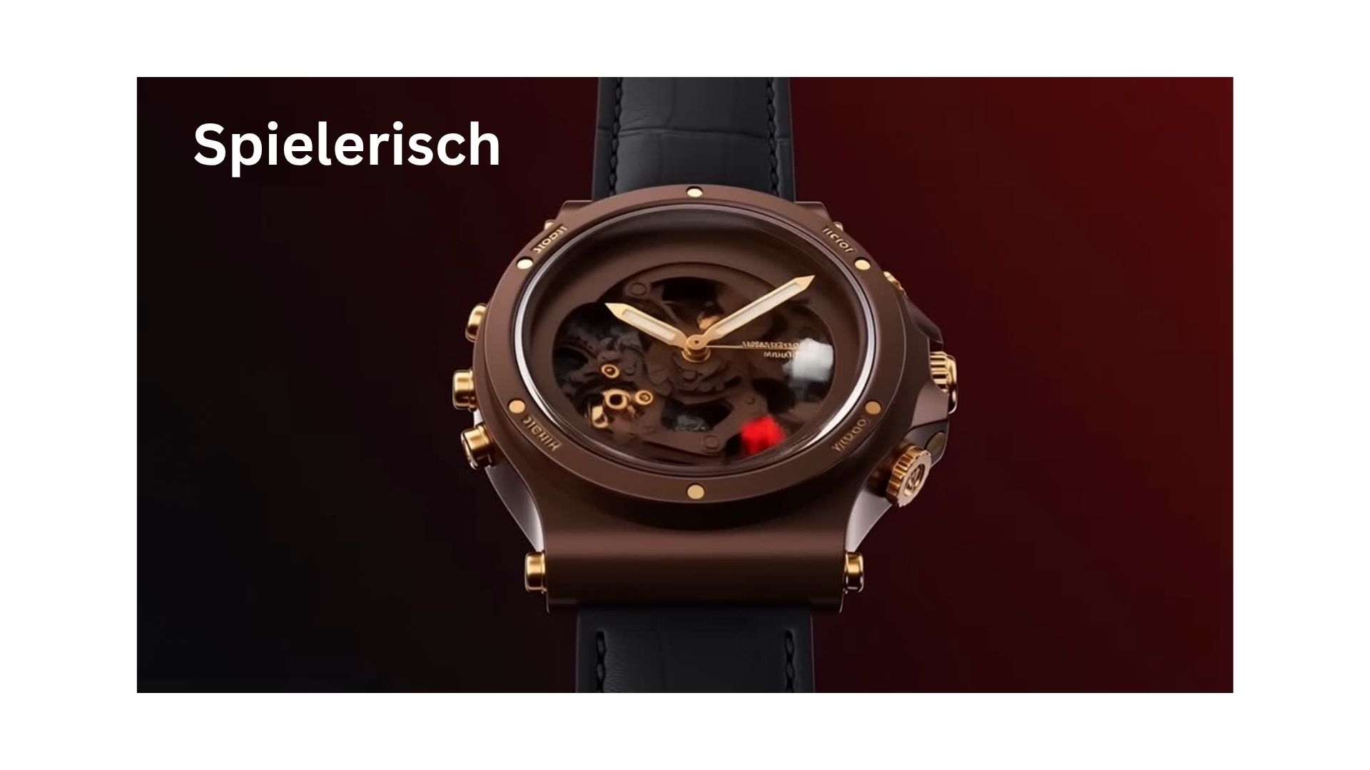
As revealed in the design of the the royal Oak watch itself, haute horology design embodies Sprezzatura—a masterclass in effortless execution that mirrors the intricate harmonic bridges formed in jazz music.
In this article we will elaborate on these from the sense of awe. One great way to see how this reveals itself to us is through the House of Wonder Audemars Piguet interface hiding under a tiny number on the top of the opening page , number 150 referring to the years since the onset of the magnificent world of Royal Oak watches.
https://www.audemarspiguet.com/en/collections/royal-oak-collection
LEVEL 1
We are going to use two words to study what wonder embodies. These are words which on the surface clash, a German word, the word Spielerish and a Japanese one the word Shibui.
Let’s treat the 2 words as colours and perfume notes , two senses which mix, poets call this Synaesthesia, I call it Life Architecture
Let’s start with Shibui.
In Japanese aesthetic literature, J. Harada, in his book A Glimpse of Japanese Ideal, describes shibui as:
“[…] that quality which is quiet and subdued. It is natural and has depth, but avoids being too showy or ostentatious. It is simple but never crude, austere but never severe. It is that refinement that gives spiritual joy.”
It has several qualities: simplicity, implicitly, naturalness, modesty, silence
Its paradox is that Shibui appears effortlessly minimal on the surface but it reveals richer details and layers of complexity the longer you observe it ~~
In the website, the House of Wonders immersive webspace Shibui lies in:
The materials: The colours of the House of wonder are muted. While the opening page is in soft beige -brown as you open up more and more windows , we experience deep greys, matte blacks and soft metallic undertones that evoke a feeling of brushed steel
Light
Like the watch itself where matt and shiny tones alternate in its design, the House features lots of shadows while it uses candle like light to illuminate movement or specific contours of a watch gear or an architectural structure. This enables the eye to relax a core requirement of Shibui elegance.
Ma – negative space
The design features ample negative space which enables the objects to breathe and command presence naturally
Submerged UI (Interface Modesty)
The House of Wonders practices modesty by making its interface nearly invisible: hidden , blended or deeply integrated into the environment
By not forcing you to click a next button, it waits for you to intuitively glide through the space
“The Delayed Reveal” (Implicit Depth ) , where information and complexity are intentionally hidden and only unfold slowly through user curiosity.
- When you first enter a room—like the Mechanical Secrets or Astronomical Observatory—you are not hit with a wall of text, technical jargon, or overwhelming diagrams.
- The Illusion: You are greeted by a single, clean, almost minimalist 3D object floating in a quiet void.
- The Reality: To the untrained eye, it looks like a simple geometric sculpture. The platform deliberately holds back its density, refusing to boast about how much data or history it contains.
- Depth depth reveals itself in layers
- The First Layer: A gentle hover or click doesn’t give you everything; it might just cause a small plate to slide open, or a single gear to shift.
- The Second Layer: As you zoom closer, the software begins to render micro-components that were completely invisible a moment prior.
Celebrating the Scars of Time (Historical Authenticity)
In a shibui aesthetic, imperfections, weathering, and historical wear are not hidden under glossy paint—they are elevated.
- The Digital Archive: When you enter the Gallery of Time room, the platform does not show perfectly photoshopped, flawless modern recreations of 19th-century
- The Reality: Instead, it renders, unedited digital scans of Jules Louis Audemars’ original hand-written notebooks from 1875. You can see the yellowed edges of the paper, the fading ink, and the slight stains from hands that worked on movements over a century ago. The platform treats these signs of age as the ultimate badge of honor.
After exploring Shibui , the base, let’s shed light on the notion of Play
Spielerisch
Spielerisch is a German word that translates directly to “playful” or “play-like.”
When a design or concept is described as Spielerisch, it means it invites you to interact with it just for the pure joy of discovery.
The Core Elements of “Spielerisch” are:
- Joyful Exploration:.
- Lack of Rigid Rules:
- Spontaneity and Wonder
- Engagement through Interaction:
The House of Wonders is a Masterpiece of Spielerisch
Interactive gamification
The design of the webpage integrates video game mechanics through the badge system. Instead of presenting a serious academic lecture about 150 years of horology it turns history into a treasure hunt, as you navigate the house like the Vault of Design or the Gallery of Time you unlock interactive digital badges, you are encouraged to level up while you explore which wakes up a sense of child like curiosity.
Free roam 3D navigation
The second way it manifests in the House is through the navigation system. It doesn’t use traditional web pages where you scroll from top to bottom. It forces you into an interactive 3D environment where you can play with your camera. There is no fixed or linear way to do this. , it encourages spontaneous experimentation according to what touched your mind and soul
Exploded Mechanical Views (The Ultimate Puzzle)
The design enables you to dismantle and manipulate highly complex watch movements inside virtual room something which taps into the ultimate childhood curiosity of taking a mechanical toy apart to see how it works. This turns an incredibly intimidating field of engineering into an open, fun puzzle.
Dynamic Audio-Visual Transitions (The Magic Portal)
The fourth display of spielerisch design is the way the website uses sensory effects and cinematic transitions to move you between different rooms.
When you move from one section to another it triggers fast immersion while the whole process is accompanied by theatrical sound effects that mimic a time travel sequence
LEVEL 2
Higher level Harmony and order – The unfolding of awe
On their own Shibui and Spielerish elements in the design are a sense of wonder. However, as with most things lasting magic lies in the accord . To make this more fun and interactive I will treat them as colours and perfume notes
Colours
If they were colours Spielersih would be the webpage hue while Shibui the undertone
In color theory, the hue is the pure color family you see immediately—It is the color at its maximum energy, completely visible to the naked eye.
The Playground of the Eye: The spielerisch elements of a design behave exactly like a dominant hue. The interactive 3D rooms, the rolling gears, and the gamified badges are highly visible, energetic, and engaging.
Why Shibui is the Undertone (The Subterranean Force)
An undertone is the hidden color temperature mixed beneath the surface. If you paint pure gold over a bright white background, it looks shiny but flat. But if you paint that same gold over a dark, matte charcoal undertone, the gold suddenly gains an antique weight, a dramatic shadow, and a luxurious soul.
The Function: You cannot always point to an undertone directly, but you feel it instantly.
Now let’s move 1 step higher and them as Perfume notes
Perfume notes
Spielerisch as the Top Note
In perfumery, top notes (like citrus, mint, or bright aldehydes) are volatile, high-energy molecules. They flash off the skin immediately upon application.The Function: Their job is to surprise, delight, and pull you in. The spielerisch elements of the website—act exactly like this. They provide that instant rush of adrenaline, curiosity, and childlike play. They are the immediate “hook” for your senses.
Shibui as the Base Note (The Lasting Foundation)
Base notes (like cedarwood, amber, vetiver, or oakmoss) consist of heavy, slow-evaporating molecules. They don’t scream for attention at the first spray, but they linger on the skin for hours, or even days
The Function: Their job is to provide depth, gravity, and structural holding power. The shibui element—are the base notes.
The Transcendent Accord: The Heart Note– Life Architecture
Let’s treat one word as a scent and the other as a colour
This radical inversion—pairing the Spielerisch color (the vibrant, golden hue) with the Shibui scent (the ancient, grounding base note)—creates a breathtakingly modern approach to Life Architecture.
While colours are processed through the conscious mind, scents are perceived mostly subconsciously
By mismatching them you create a cognitive short-circuit a Semiotics Paradox that makes you unforgettable.
When these two specific codes collide in human existence, they activate three timeless codes of mastery that have guided history’s greatest architects, alchemists, and visionaries:
1. The Code of Enlightened Nonchalance (Sprezzatura)
In the semiotics of life, if you only display Shibui (the heavy base note), you can appear stiff, unapproachable, or stuck in ancient history. By layering the Spielerisch hue over it, you unlock true Sprezzatura—the art of making the near-impossible look entirely effortless.
- The Application: Your daily actions, your social interactions, and your creative projects are painted in brilliant, high-energy gold and teal tones. You speak with wit, you take risks, and you treat massive obstacles like a fluid 3D puzzle. To the outside world, your life looks breezy, lighthearted, and beautifully spontaneous.
- The Subliminal Code: The world thinks you are just playing a game. They do not see the crushing discipline, the silent morning routines, or the unshakeable inner boundaries (the cedarwood Shibui base note) holding up the entire stage. Your depth funds your play, allowing you to wear your heavy armor like a silk scarf.
In reality
You are deliberately pairing elements that are not complementary. This is the exact code that birthed the 1972 steel Royal Oak watch, and the exact code that defines Hermès’ asymmetrical porcelain patterns.
This is the true birth of awe and the coherence within the design of the whole webpage of Audemars Piguet.